Bug Fixing
Introduction
One of the most important skills a developer needs is bug-fixing. It’s unlikely that your code will work as you expect it to every time, and being able to diagnose and fix it is a vital part of the process of development.
There’s nothing wrong with debugging and it is just a natural part of development. Sometimes we can feel a bit overwhelmed with the errors we’re getting back, and often it’s a good idea to take a step back for a while, and come back to the code with a fresh pair of eyes.
A technique called “rubber duck debugging” is the idea that you should have a rubber duck with you as you develop in case you get stuck. When you get stuck, talk to the rubber duck and explain your code to this duck. The reason for this is that sometimes we can get so caught up in our code that taking a step back and explaining it to a person (or a duck) can give us a bit of perspective.

One common issue that you will get better at as you become more experienced, is over-complicating solutions. We try to write CSS in such a way that we don’t repeat ourselves (DRY) and don’t write too much code, and thus we end up with spaghetti code unable to tell what is affecting what.
Developer Tools
Most major browsers have built in Developer Tools to help you work on your projects. Here you can add and remove HTML elements and CSS styling to eventually find where the issues are, and what is causing them.
In this lesson we’ll be looking at Chromes developer tools, but Firefox has similar tools.
To open your developer tools, press: Ctrl + Shift + I or F12 on PC, and Cmd + Opt + i on macOS.
You can also open it by right clicking an element and then clicking `Inspect Element“.
Delete Node
When debugging a site, especially if there is a horizontal scrollbar and you can’t find what is causing the horizontal scrollbar, it’s a good idea to find out which element is causing the issue.
Slowly remove elements from the page until you eventually see which element is causing the issue.
To remove elements from the page, right click and select delete node.
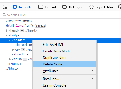
You can also create a new node, or duplicate a node.
Hide Node
When an element is selected, press H key to hide the element. This is useful when you want to see what is happening behind the element.
Edit as HTML
To change the HTML that is displaying on the page by directly editing from the console, choose Edit As HTML.
Select the parent element that you want to edit, and then add/change/remove any of the HTML inside your browser window.
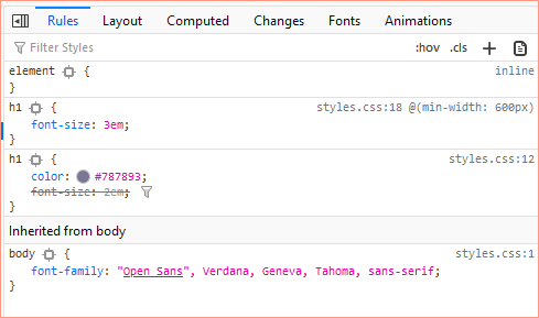
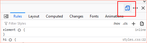
Style Rules
You can see what styles are applied to an element by selecting it in the Inspector and then viewing the styles applied under Rules.
In this example, we are looking at the h1.
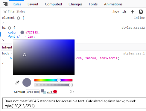
WCAG Checker
Another useful tool is the WCAG checker which allows you to see if the colour of your text is WCAG compliant. Simply click the colour circle under Rules and it’ll open up an option for you to adjust the colour. At the bottom it compares the text colour with the background colour and tells you whether it is compliant or not. In this case, the colours are not WCAG compliant.
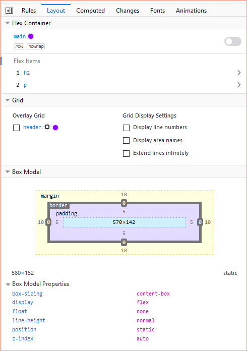
Layout
A handy tool when working with Chrome and CSS Grids, as well as for spotting any issues with the CSS Box Model, is the Layout tab.
In the example below, we can see that the main is set to flex, and we can see which items are the flex items. We can also see that the header is using CSS Grid.
Below that, we can see that the selected element has a margin of 10px, a border of 0px, and padding of 5px. These values can be edited directly in the developer tools.
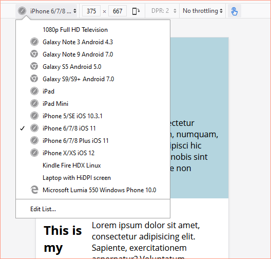
Responsive Design Mode
The Responsive Design Mode allows you to test your site at various screen sizes. To toggle it on, you can click the icon which looks like a phone and tablet, or press Ctrl + Shift + M on PC and or Cmd + Opt + M on macOS.
From here you can choose a preset screen to view on. You can update and choose which device screen size you’d like it to mimic. You can also update the orientation to see how a user might see the screen in landscape on a tablet, for example.
A nice feature on Firefox is that it allows you to close the inspector and still have the responsive design mode on.
More to Explore
There is plenty more to explore on the developer tools. Experiment and play around with different features to see what helps you in your development. As we work with JavaScript later in the course, you’ll get even more out of the developer tools.
Testing and Validation
A key part of development is validating your code to ensure there aren’t simple errors. If you’ve been working with the same code for a long time, you might not spot a basic typo or error. Using external tools to validate and test your site is key to creating bug-free code.
Validator.w3.org
One tool you can use to validate your HTML is validator.w3.org. Simply paste your web page’s URL into the address bar, and it will point out any basic errors or mistakes. It will usually also make recommendations on how to fix each error.
Google Lighthouse
Another popular tool for auditing your website is Google Lighthouse, which is available through Chrome’s Developer Tools. Google Lighthouse runs a series of checks on your website to tell you how the page has scored on aspects like performance, accessibility, best practices, and SEO. It also gives you suggestions for improving these different aspects.
Cross-Device Testing
A very useful way of testing your website is to use it on a variety of devices. The more devices, operating systems, and browsers you can use to test your site on, the better. Catching things like fonts not loading correctly is easy to spot. Occasionally a browser will fix an error in the code to present a page that looks correct but isn’t, another browser might not fix that same mistake.
It’s worth noting that for your studies, we do not expect you to support Internet Explorer.
Activities
Activity 1
WATCH
The below tutorial video on Debugging and Firefox Developer Tools. (38m 44s)
Activity 2
READ
Reference guide: Firefox Developer Tools
Lesson Task
Brief
Use your developer tools to test your website and help iron out bugs which have crept in.
Level 1 Process
- Open up your developer tools in your browser.
- Use the responsive design mode and make sure that there are no horizontal scrollbars at any width as well as that the site looks good across screen sizes.
- If you do encounter bugs and issues, use the developer tools to figure out what went wrong and how to fix it.
- Check your text colour is WCAG compliant with background colours.