Take Action and Get Feedback
Introduction
This lesson contains 2 activities that you should complete as you go through it.
How Do Users Do, Feel and Know
Bill Moggridge and Bill Verplank were busy designing the first laptop when they coined the term ‘Interaction Design’ in the mid-1980s. It was a time when computers were moving away from industrial interactions, to interactions with every day people looking to perform a variety of tasks.
Verplank says there are 3 main questions a designer should ask:
How do people do?
What sort of ways can the user interact with the system and change it? Can they input text and search or must they click on links to move forward. Verplank talks about a difference between buttons and handles. When users use buttons they are exact and the user only engages in a minimal way. When users have handles, they are actively involved in changing what they see and how they interact with it. Does a website’s users want to interact in a simple but exact way, or do they want to play around?
How do people feel?
This is concerned with what feedback the users receive and how that makes them feel. Marshall MacLuhan identifies two types of media: hot media which is strong and immovable with rich data, while cool media draws you in to engage with it.
How do people know?
This question is concerned with how the user can know what to do and where to go. How do you guide the user through the process?
What To Do
The first thing a user assesses is what they can do. On a desktop or latop they can use their mouse or track pad to click, scroll and drag, and they can use a keyboard to enter text. On a mobile device they can tap, zoom in or out, scroll, flip their device and more.
Invite Interaction
Because web pages are 2D they have to work harder than 3D objects to invite interaction. We need to guide the user’s eyes towards the areas of the page that can be interacted with.
We can do this by using bright colors for call-to-action buttons, or using roll-overs or hover states to indicate action when the user mouses over certain areas. This is harder to do on a mobile device as there is no cursor moving around the page indicating sections of interaction.
We must use affordances and signifiers to show users where to interact.
Constraints
A great way to guide users to figure out what to do is by using constraints. Constraints automatically remove the number of possible options. A square peg can’t fit in a round hole.
When you are putting a puzzle together, there are clear constraints on certain pieces. A piece with a flat side, can only be for the outer part of the puzzle, or if you find a blue piece it’s likely either the sky or the water. These constraints help us categorise and order our tasks.
The more time a user needs to decipher what to do, the less likely they are to interact. By removing options you’re cutting down the time needed to figure out what to do next. It’s important that these constraints can be clearly seen and interpreted.
Take the USB port for example. How many times have you tried to put a USB into the port and put it in the wrong way round? Because the up and down views look the same it’s difficult to guess. If there were clear physical constraints, like if the bottom was rounded, it would be much easier to know which way it should go.
Ensure Desired Behaviour
Sometimes constraints can be used to ensure the desired behaviour occurs. When you are going to go into a secure area, the website might force you to sign up or log in. Alternatively, when you’re closing down an unsaved document, the program might ask you whether you want to save ensuring you don’t lose unsaved work.
Both of these are constraints, but they help to make sure you achieve the correct goals.
Discoverability
As you interact more with a website or app you need to become better at knowing what to do and finding out new things you can do on the site or app.
If you are going to create a website or app that people will continue to engage with, it’s important that you allow them to learn all that they can do on the site or app. Otherwise they’re likely to lose interest or not be able to get the most out of the product.
Inputs
Unlike other aspects of interaction design, inputting data and information has received less attention. Computers are much more logical than humans and so expect to receive data in logical ways, but this often causes a disconnect between the two.
Humans tend to be more grey in their storage of data and inputting of information. We might ask someone “where are you?” and be satisfied with a response of a town name, but a computer might require exact GPS coordinates that the user just wouldn’t have.
Luckily advancements in technology have meant that we can assist users more and more to quickly and easily be able to input the necessary information.
Cleaning the data
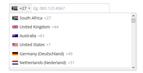
Because computers need clean data - that is data in a specific format - it often forces users to clean the data themselves. If you’ve ever had to put a phone number into a form, you’ll know the problem. Do they want me to include a country code? Should it have the plus sign or not? Can there be spaces between groups of numbers?
As far as is possible, the user should not have to carry the burden of cleaning data. It reduces efficiency and causes anxiety and frustration for the user. When a website or app forces the user to use strict data formats, it can alienate the user.
Helpful Ways To Input Data
Use dropdowns, check-boxes, and dialog boxes. These reduce errors and increase efficiency. For certain text fields you can use auto-completion to ensure that the correct options are being chosen.
Break up longer inputs if appropriate. For numbers or addresses this can be more intuitive. It can make sense for everyone that you input a postal code as separate to the street address or city.
Warnings and visual clues are a good way to alert users to potential problems, but don’t hold everything up just to force them to write the data correctly.
Use dropdowns, check-boxes, and dialog boxes. These reduce errors and increase efficiency. For certain text fields you can use auto-completion to ensure that the correct options are being chosen.
Warnings and visual clues are a good way to alert users to potential problems, but don’t hold everything up just to force them to write the data correctly.
What to Feel
As the user starts to interact with the interface we need to provide quick and direct feedback for the user. For example, if the user wants to drag and drop a file and clicks and holds the cursor we should show the file becoming untethered from the interface and floating on the interface creating a space for them to drop the file.
Without feedback the user wouldn’t know if their actions were getting them closer to their goal. It lets the user know whether they should keep doing what they’re doing, or stop it and change.

It is essential that the feedback we create enhance the user’s experience and makes things more easily understood, rather than adding unnecessary complications. If the feedback is too dominant it can distract the user. Feedback that is too removed and quiet can be missed by users.
Feedback must answer these questions
Location
Where am I now? Where can I go to from here? How do I go back to where I came from? We need to quickly provide feedback to them about where they are and what actions caused them to get there. This is especially important for landing pages.
Progress
How far along the process am I? How much further is there to go? Using progress bars can provide very useful feedback for users as it lets them know how much more is required for them. Users can then work towards an end goal.
When downloading an application, it’s useful to get a time estimate to how long it will take to download. Or when we’re filling in a form, it’s useful to know there are 3 pages to fill in and be able to visualise how long it will take to complete.
Outcome
Is the outcome what I was expecting? What connects the actions I performed with the outcome I got? We need to clearly show users what has changed as a result of their actions. Without this, they won’t know whether they were successful or not, and whether the result was what they were wanting to achieve. Success pages are an example of this, but they should include a representation of what was completed.
If the outcome is not what the user was expecting we need to provide opportunities for them to correct the problem.
What to Know
Learning
When someone starts learning to play the piano, the teacher often suggests writing labels for each key so that the student learns which key is which. After a while the student learns where the keys are by feel and doesn’t need to read the labels. In this example the knowledge has passed from ‘the world’ into their head.
Knowledge that’s in your head is much easier to access but it also requires more time to learn it. Knowledge in the world often takes more time to process but it can be more accurate than relying on your memory.
Luckily we receive assistance from technology through things like spell-checkers and search engines; we can easily get feedback to get knowledge in the world.
When people learn and start to categorise how to perform specific actions, they do so in general terms. Unless they use the product regularly, they’re unlikely to remember specific steps. And often similar processes on other sites will be combined as one concept.
It’s very difficult for humans to remember arbitrary information like passwords which are usually un-emotive and can’t be linked to a process. Because of this, users write passwords on sticky notes and put them beside their computer. This increases the security risk, completely defeating their purpose.
The issue of our inability to remember arbitrary information is exactly why we need to ensure users don’t have to be precise when interacting.
Memory
Don’t push people to remember things. We can only hold a few items of information in our short-term memory. The more you ask the user to remember, the more likely they are to forget and cause errors.
A good way to help the user is by auto-saving information so that they don’t have to go back and fill in information again. Automatic log-outs are especially frustrating in this regard. When you’ve inputted information and then get logged out and forced to re-input that information - it can be a major issue for users.
Activities
| Activity 1 READ From About Face: The Essentials of Interaction Design, Paperback, 2014, by Alan Cooper et.al. Chapter 13: ‘Metaphors, Idioms, and Affordances’(2hr) |
|---|
| Activity 2 WATCH Videos: Interaction Design Foundations 10. Designing for Behaviour and Interaction 11. Best Practices for Providing Feedback (45m) |
|---|
Lesson Task
Brief
Choose an area of interactivity on your cross-course project such as the “add to cart” and consider how you can improve the feedback users get from their interactions on the site.
Using your skills in JavaScript as well as the skills learned from Interaction Design, work at improving how this area of interactivity can be made clearer for users