Info Architecture and Design for the Middle
Introduction
This lesson contains 2 activities that you should complete as you go through it.
Information Architecture
A good information architecture is important to ensure that when the user arrives on your site or app, they’re able to easily understand what the site is about and how to interact with it to complete their goals.
A user will often open multiple results from a Search Engine Results Page (SERP), and browse each of the results. They quickly evaluate whether this is the right website for them to spend the next few minutes on. Having a clear information architecture helps them make this decision quicker, and if the site is right for them they’re more likely to stay and browse. If users are unsure of where to begin, or don’t understand what the site is about, they’ll bounce and find a site that does answer their immediate questions.
Information architecture is more than just navigation and encompasses how content is organised, labelled and displayed to users, including what terminology is used and which call-to-actions are highlighted, etc.
It’s important that the correct terminology is used to ensure that users know where they should be going. Often the designer or website owner might have specific jargon or terminology that they use which users might not understand.
Learn from users
Card sorting
As we learnt earlier in the course, it’s important to know your users and learn from them. One technique for understanding the users and how they categorise pages and content is through card sorting. People often struggle to articulate how they envision things, and so it’s useful to use a technique like this.
Card sorting pretty much is exactly what the name suggests. The users get given cards with tasks or pages on them and are asked to sort the cards into categories that make logical sense for them.
The users can either create the cards on their own, or the facilitator of the card sort can create the cards for them. The cards need to have a similar granularity across the group, so if you’re choosing to break the site down into a list of pages all the card should be of a similar level.
Cards could be, for example, “contact us page” or “red shoes product page” or “fill in form” depending on what you’re trying to analyse and how you’re approaching the card sort.
When the users are grouping the cards it’s important that they are neither too big or too small. If they’re too big they could be divided into a separate section, and if they’re too small they might fit into another category. It’s important not to push any particular model and ask open-ended questions to understand the user’s perspective.
Once the users have grouped the cards together, ask them to create category labels for the different groupings. This gives us insight into how they see the groups and offer potential options for our hierachy.
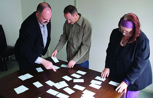
“CS003: Figure 1.3” by Rosenfeld Media, photo licensed under CC BY 2.0 (https://www.flickr.com/photos/rosenfeldmedia/3343498557/in/photostream/)
Creating your information architecture
Once you have analysed a number of users you will start to see trends in the group and how people have organised the content. These can give clues to how to move forward and start creating a proper architecture.
Once you have a basic outline you can use reverse sorting to see if the information architecture you have come up with meets the users expectations and understandings.
The main categories won’t neccessarily become the main menu items, some might be able to move into the footer or into a sidebar section. The main categories should just focus us onto how the user is envisioning the content.
Design for the Middle
A website or app will attract many different users over its lifetime, but all the users will start out as beginners to the product. Some will use it more regularly and become intermediates and some will use it every day and become experts with it.
It’s important that we build our products so that they appeal to all three groups of people. If we create an interface that is complicated we might appease some of the experts who have all the functionality that they want, but it’s likely to alienate beginners.
Most people move quite quickly into the intermediate state after a few sessions on a site. In fact, they could even be intermediate users even if they haven’t used your product. If they have experience on similar products and you’ve used conventions to your advantage, they’ll quickly transition across.
When training users from beginners to experts, it’s important to ensure the website is consistent and when users take certain actions, the product always reacts the same way.
Experts generally want more functionality than the average user and they want to be able to use shortcuts to quickly achieve their goals. Not everyone needs to use the shortcuts and so normal navigation should be used, but over time you’ll want to complete tasks quicker.
Progressive Disclosure
Using progressive disclosure we can remove clutter and only show users the data that is applicable to them at this stage. This way they aren’t distracted easily and can focus on what’s important.
Instead of showing all the available options up front, we guide the user through a process revealing more and more detail as we go. While it might seem to be making the process longer and therefore making the UX worse, it’s actually making it better as we take the user on a journey and don’t force them to make too big a decision too early on.
People are happy to click links as long as it’s moving them closer towards their goals. Often adding more pages can actually move the user towards their goals quicker than giving them the full range of options and asking them to pick.
Analysis Paralysis
There is a story from ‘Aesop’s Fables’ about a fox who boasted about having hundreds of ways to escape his enemies, while the cat only had one way. When a group of hounds came for the cat and fox, the cat quickly ran up the tree but the fox was caught undecided between his various strategies.
Sometimes users can become overwhelmed by the number of options set before them that they fail to take any action. They are presented with too many choices and experience what is known as the Paradox of Choice. At first it might seem that what everyone wants is more choice, but actually humans want restrictions placed on them. That way they can be more sure of the decision they’re making and the likely outcome.
Effort vs Reward
If users see the reward as good, the more effort they’re willing to spend getting the reward.
If they don’t see the reward as particularly enticing and there are a number of hurdles in their way (from learning a new system, to inputting their contact details), the less likely they are to complete the task.
Your user is smart
There’s no need to dumb things down for your user. They’ve likely used websites or apps like yours before and know what they want to do. This means using industry standards are important, and viewing competitor sites is an important tool in designing your product.
The user will be more effective and efficient if they don’t need to re-learn a whole new system. You can leverage their previous experience and avoid having to use dumbed down navigation, terminology or unnecessary tool tips.
Your user is dumb
While in some instances your user might be smart, your users are also dumb and this is why it’s important to design for the middle.
When making choices about terminology, navigation etc. it’s best to choose the lowest common denominator. You’re only as good as your weakest user, and so even the weak users should be able to use your app or site.
Activities
| Activity 1 WATCH Video: User Experience: Information Architecture (1h 57m) by XDA. |
|---|
| Activity 2 READ From About Face: The Essentials of Interaction Design, Paperback, 2014, by Alan Cooper et.al. Chapter 10: ‘Optimizing for Intermediates’(2hr) |
|---|
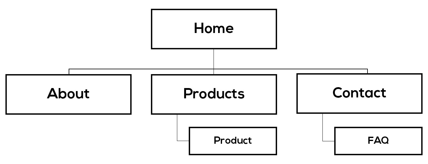
Lesson Task
Brief
Design the information architecture for your cross-course site.
This will:
-
give you an overview of the content across the site and how it is divided up.
-
give you a good way of analysing the user’s flow as they move around the site.
-
ensure that you’re making it as easy as possible for the user to achieve their goals.
You can use a format like the image below, to show your site’s information architecture.